Line Graph
Line graphs can be used to show how information or data change over time. They have an x-axis (horizontal) and y-axis (vertical). Usually the x-axis shows the time period and the y-axis shows what is being measured. Line graphs can be used when you are plotting data that have peaks (ups) and troughs (downs). In other words, they highlight trends.
Sample Questions
Cinema attendance in the UK
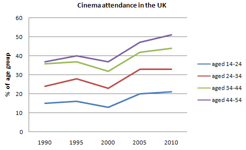
The line graph gives information on cinema attendance in the UK.
Summarise the information by selecting and reporting the main features, and make comparisons where relevant.
London Underground station passengers
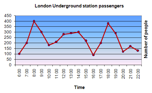
The graph shows Underground Station Passenger Numbers in London.
Summarise the information by selecting and reporting the main features, and make comparisons where relevant.
Australia's share of Japan's tourist market
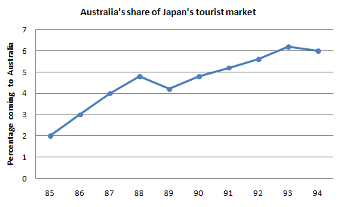
The chart shows the number of Japanese tourists travelling abroad between 1985 and 1995.
Summarise the information by selecting and reporting the main features, and make comparisons where relevant.
Expenditure on Fast Foods by Income Groups, UK 1990
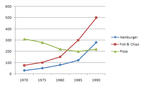
Write a report for a university lecturer describing the information in the graph.
Summarise the information by selecting and reporting the main features, and make comparisons where relevant.
Dubai Gold Sales 2002
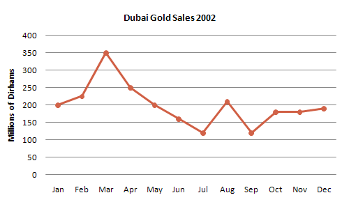
Write a report for a university lecturer describing the information in the graph.
Summarise the information by selecting and reporting the main features, and make comparisons where relevant.
Consumption of Fast Food in the UK
Write a report for a university lecturer describing the information in the graph.
Summarise the information by selecting and reporting the main features, and make comparisons where relevant.
Infant Mortality and Life Expectancy, 1970 - 1992
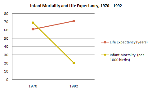
Write a report for a university lecturer describing the information in the graph.
Summarise the information by selecting and reporting the main features, and make comparisons where relevant.
Rates of smoking in Someland - men and women
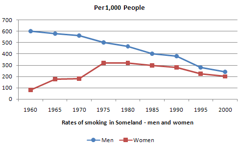
Write a report for a university lecturer describing the information in the graph.
Summarise the information by selecting and reporting the main features, and make comparisons where relevant.
Acid level in mouth from consumption of sugars/honey
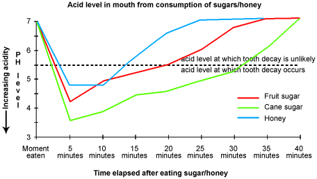
Write a report for a university lecturer describing the information in the graph.
Summarise the information by selecting and reporting the main features, and make comparisons where relevant.
Sales and share prices for Coca-Cola
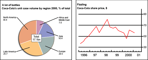
The chart and graph give information about sales and share prices for Coca-Cola.
Summarise the information by selecting and reporting the main features, and make comparisons where relevant.